Retail e-commerce sales are projected to exceed US$6.3 trillion worldwide this year (yes, that’s trillion), having reached an estimated US$5.8 trillion in 2023. Projections indicate that, by 2027, this figure will have surpassed US$8 trillion.
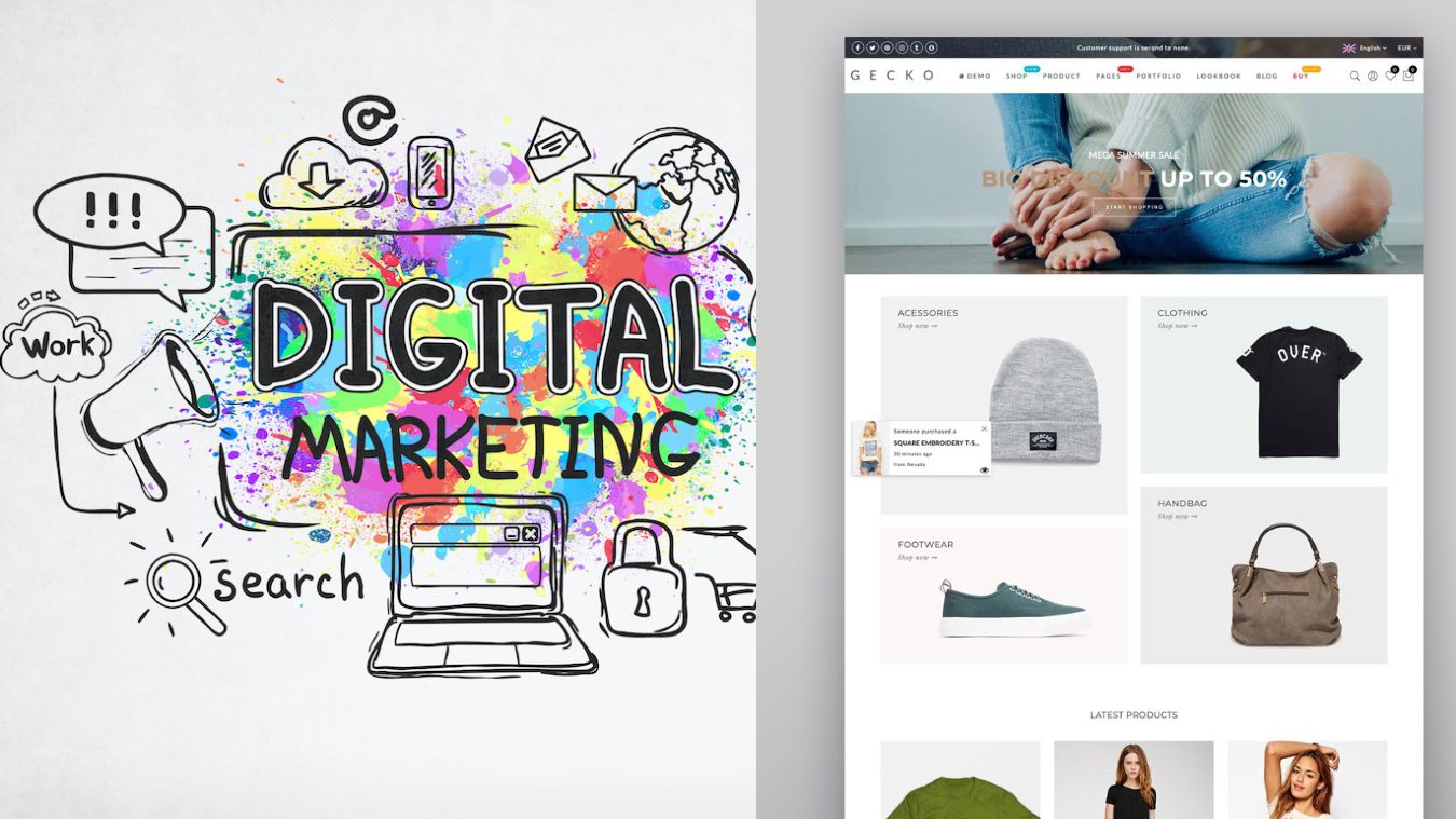
We are living in an era underscored by the omnipresent hum of e-commerce, where the dynamics of consumer interaction shift as the digital marketplace evolves. At the heart of it all lies the concept of the digital shelf, a battleground where products vie for consumers’ attention.
Understanding the Digital Shelf
The digital shelf is essentially the online counterpoint to a bricks-and-mortar shelf, presenting multiple items on a single screen. Unlike the physical retail environment, products can’t appeal through tactile sensations or strategic placement.
As a packaging design agency that helps brands deliver successful omnichannel experiences, our challenge is to use our design and photography expertise to make our clients’ products stand out.

Optimising for the Mobile Experience
Imagery is absolutely essential for success on the digital shelf. Generally speaking, retail partners will expect a minimum standard of images for a product to enable a listing online (this is usually covered by the GS1 standard), but one of the most important requirements is that they must be mobile-ready.
It’s hard to overstate the importance of this. For context, experts estimate that mobile commerce sales will account for 62% of all retail sales by 2027.
GS1’s guidelines for enhancing packaging for the digital shopper (who may encounter the product as a diminutive 1cm x 1cm image on their device) showcase conformant examples and outline best practices.
Communicating Through Imagery
Mobile Ready Hero Image (MRHI) guidelines were originally developed by researchers at the University of Cambridge in collaboration with Unilever back in 2018 to improve the mobile shopping experience.
They focus on clearly showing the brand, product type, variety, and quantity of each SKU (the GS1 refers to these elements as ‘the 4Ws’ throughout their guide).
However, it’s not just the hero image that needs special attention. Most online retailers now support the inclusion of multiple images per listing, offering an opportunity to bolster shopper engagement and decision-making.
An average of 3-4 images is recommended, with the primary image being the most clickable and the supporting images comprising lifestyle shots, product use shots, instructions for use, and serving suggestions. It’s also useful to show products to scale to avoid misunderstandings.
Many retailers also have the capability to integrate rich media such as videos and gifs, along with enhanced Product Detail Page (PDP) content (e.g., comparison charts) into a product’s listing. This not only enriches the shopper’s experience but has also been shown to significantly drive conversion rates.
The growing importance of incorporating moving images into the online experience means video and gifs are most valuable in giving the product and brand a chance to share their personality.
For this reason, there needs to be context to the environment in which videographers choose to capture the product; ideally
Using Copy to Your Advantage
For consumers to find your products, they have to be searchable. This means making product copy rich in keywords that shoppers are likely to use to locate your product.
When we talk about copy, we’re referring not only to the title but also to the feature bullets, product descriptions, and metadata, all of which are key elements of site search optimisation (SSO), leading to higher indexing on retailer search rankings.
Each element works slightly differently. A title may feature descriptors such as flavours or benefits to stimulate click-throughs, while bullet points go into specifics and provide further detail to help enhance conversion rates.
Additionally, it’s important to talk to consumers in a way they understand. I would always advise using their terminology as a chance not only to connect but to build on that connection.
Adding Social Proof
In its report ‘Decoding Decisions: Marketing in the Messy Middle’, Google explored how various behavioural science principles affected shopper preference. One of the key behavioural principles they identified was social proof, the propensity humans have to follow the opinion, advice, and behaviour of others in our own decision-making.
This is why another common and crucial element of the digital shelf is the review section. According to Mintel, when it comes to triggering shopper engagement, the minimum number of positive reviews is 15, with an average star rating of 4 stars.
Building a Digital Shelf Strategy
While the areas we have touched on aren’t rocket science, they do showcase some of the most important facets of a digital shelf strategy—the ‘must haves,’ if you will.
While creating a standout digital presence demands a comprehensive strategy, brands can land quick wins by optimising imagery and copy, leveraging rich media, and providing social proof to create a compelling narrative that captivates and converts its audience.
However, for a truly seamless omnichannel approach, we need to think beyond simply optimising the assets we create for the physical space and start designing unique assets that create standout in the digital area. When it comes to performance on the digital shelf, this is the difference between good and great.


Leave a Reply