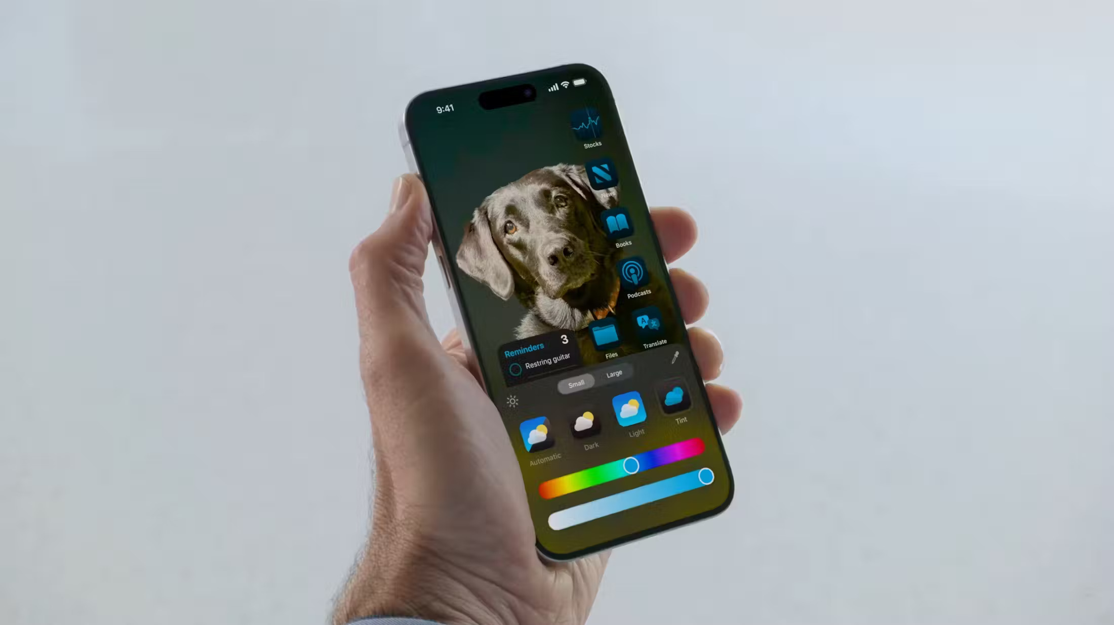
In iOS 18, Apple has introduced a new customization feature for the iPhone Home Screen that allows users to add a tint to their app icons. This feature offers a fresh approach to personalizing the device’s appearance by applying a consistent color overlay across all icons, creating a uniform look throughout the Home Screen, App Library, and app pages.
The tinting process begins by desaturating all app icons and removing their original colors. Afterward, a single color overlay is applied, resulting in a monochromatic effect. While this removes the original colors, it provides a cohesive and stylish appearance that can be tailored to match personal preferences. Users are encouraged to experiment with this feature to achieve their desired aesthetic.

To select a tint color, users can either use an eyedropper tool to pick a shade from their wallpaper or manually adjust hue and saturation with slider bars. This customization flexibility allows for precise matching with the background or creating a contrasting effect. This means users can create a harmonious design or make their icons stand out against their chosen wallpaper.
It is important to note that the tint feature is applied universally across the entire device. This means you cannot set different tints for different app pages or sections. Once a tint is chosen, it affects every instance of an app icon on the Home Screen and other areas, ensuring a consistent look throughout.
To apply the tint, users should long-press a space on the Home Screen, tap “Edit” in the top-right corner, then select “Customize” and choose the “Tinted” option. Adjustments can be made using sliders or the eyedropper tool. To finalize, tap anywhere outside the Customize panel. This new feature complements the existing Dark mode option for app icons in iOS 18, adding more ways to personalize the iPhone experience.


Leave a Reply