
Nothing has carved out a unique identity among Android fans with its blend of transparent hardware and a dot-based software design. While some elements of this approach have been praised—such as the creative Glyph Interface—others, like the jarring ringtones and notification sounds, have divided opinion.
However, as Nothing continues to evolve, it’s clear that the company is learning from past experiences, especially with the release of the Nothing OS 3.0 beta. Early feedback suggests that this version represents a refinement of the company’s original vision, one that Carl Pei likely intended when he left OnePlus.
One of the key features that fans have loved is Nothing’s use of dots in its design, and ahead of the Nothing OS 3.0 beta, the community made it clear they wanted to retain this aesthetic. Fortunately, the dots have stayed, albeit with some modifications.
The classic dot font is used less frequently, but new dot-based animations, like the ripple effect on the fingerprint sensor when unlocking the phone, add a fresh touch. The weather app is also being overhauled, introducing varying dot sizes to more naturally represent weather conditions, moving away from the overly simplistic designs of previous iterations.
The dot-based design continues to shine in many of Nothing’s widgets. For example, the pedometer, screen time tracker, and camera launcher all use dots to visually represent data in an engaging yet minimalistic way. While this design language is a core part of Nothing’s identity, there are areas that could still be improved.
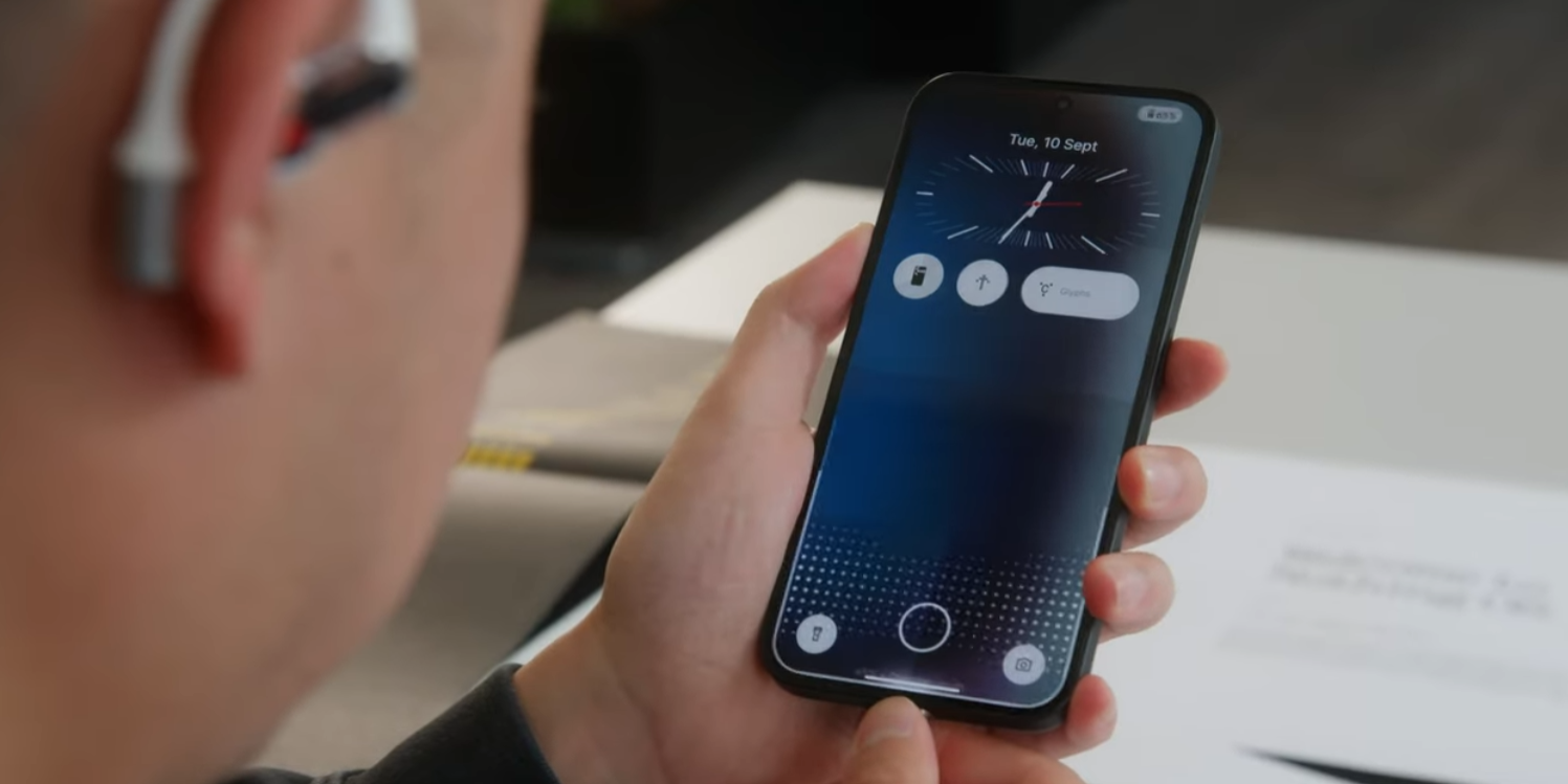
For instance, the lock screen customization options are a step in the right direction, but the default weather widget is too simplistic, providing only basic information. More detailed options are available, but it would have been better if the detailed widget were the default, ensuring a more useful experience for all users.
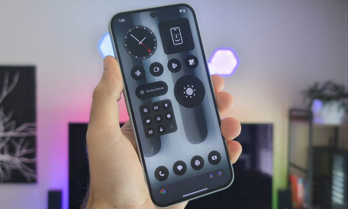
Customization is one of the main focuses of the Nothing OS 3.0 update. Users now have more control over how their device looks and feels, with increased options for personalizing the lock screen, quick settings, and app drawer.
This is a positive development, giving users the ability to create a more personalized experience. However, while customization is appreciated, some of the default settings still leave something to be desired. For instance, the default weather and battery widgets are too basic, with the latter only being visible when the screen is darkened, making it less practical.
Interestingly, some of the changes in Nothing OS 3.0 seem to draw inspiration from Apple’s iOS, particularly with the redesigned quick settings and app drawer. Though this is not inherently negative, the resemblance to iOS 18 is noticeable. For example, the quick settings have been streamlined, with the brightness slider now positioned at the bottom of the dropdown—a small but significant improvement.
On the other hand, the Smart Drawer, which organizes apps based on usage, feels less refined. While it does a decent job of categorizing games, some apps are placed in confusing folders, such as Gmail being in “social” and Chrome in “utilities,” which makes the drawer feel more cluttered and less efficient.
Despite these rough edges, the broader elements of Nothing OS 3.0 show great potential. The software is still in its beta phase, but early impressions suggest that it is becoming more cohesive and polished. While some features, such as AI-powered capabilities, are still missing, the design foundation is solid.
The iconic dot-based aesthetic, combined with the familiar black, white, and red color scheme, remains at the heart of the user interface. These core elements, along with improvements in user experience and interface design, indicate that Nothing is moving in the right direction with its software.
There is a growing sense that Nothing OS 3.0 could eventually become one of the best Android skins on the market, provided the company continues refining its approach. Longtime fans will appreciate the continuity of the dot-based design, while new users will likely find the software approachable despite its deviations from other Android skins.
Rather than attempting to oppose mainstream Android interfaces like One UI or Pixel UI, Nothing seems to have found a balance, offering something distinct yet user-friendly. However, there are still moments when it feels like the company is pushing the design too far, like with the Smart Drawer, where the app sorting feels half-baked.
As Nothing prepares for the full release of OS 3.0, there are still a few features to look forward to, such as the ability to share widgets between devices. These updates, along with further refinements to the user interface, could solidify Nothing OS 3.0’s place among the top Android skins. However, the company will also need to maintain a commitment to regular software updates to fully realize its potential. If Nothing can continue to improve and fine-tune the software, it could soon rival other major players in the Android market.
For those eager to try out Nothing OS 3.0, the public beta is already available for the Phone 2a, with owners of the Phone 2 waiting until November 2024. Those with older models, such as the Phone 1 or Phone 2a Plus, will need to wait until December to join the beta.
With several months left before the final release, there is still plenty of time for Nothing to tweak the software and address any lingering issues. All signs point to Nothing OS 3.0 becoming a highly refined and competitive Android skin, provided the company continues to focus on its core design principles while improving overall functionality.